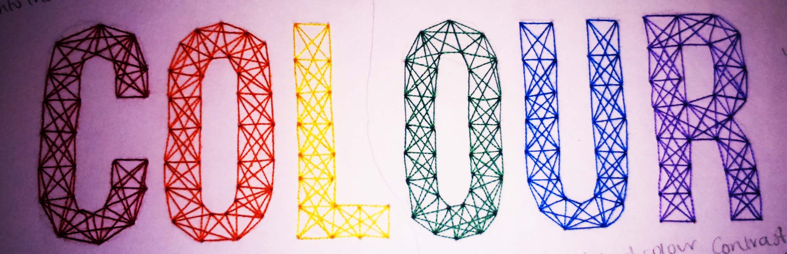
Understanding Colour 1
Posted: December 24, 2014 Filed under: Field | Tags: art, colour, illustration, theory Leave a commentI chose to do Understanding Colour for my field option because I’ve noticed that my work is very brown and grey. I do sometimes add colour to my work but I’m not sure it’s always successful. I also enjoyed Tom’s workshop at the beginning of the year about form and colour and wanted to look more into it. Our first lecture was fairly interesting, but I had already looked at a lot we had talked about while in my Foundation course.
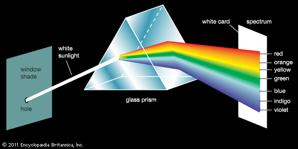
”In 1676 Sire Isaac Newton, using a triangular prism, analysed white sunlight into a spectrum of colours”- The Elements of Colour by Johannes Itten,
According to him there were 7 types of colour contrast;
- Contrast of hue (black/white, red/yellow/blue)
- Light/ Dark contrast
- Cold/ Warm contrast (More distant objects appear colder in colour)
- Complimentary contrast
- Simultaneous contrast
- Contrast of saturation
- Contrast of extension (Proportions of complimentary pairs are
Yellow : Violet = 3 : 1
Orange : Blue = 2 : 1
Red : Green = 1 : 1
There is also a chapter on what I find most interesting; the relation of colour to form. We all related colours to shapes. Is this because of outward stimuli (e.g. seeing road sings) or because we there is something inherent about the shapes.
Red – Square…. Weight and opacity of red agree with the static, aggressive shape of the square
Yellow – Triangle …. Symbol of thought matched with lucid yellow
Blue – Circle…. Relaxation and smooth motion. Symbol of spirit.
+ + +
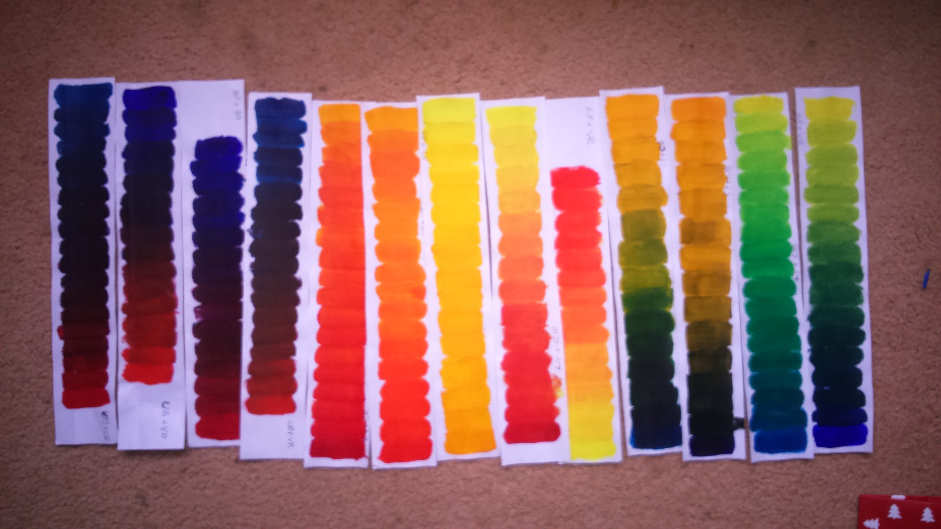
In the afternoon we looked at how there are three primary colours; red, yellow and blue. And three secondary colours; green, purple and orange. But then there are several different types of the primaries, especially when you’re painting. These paints are not “pure” primaries, but rather slightly mixed with other secondaries.

This means you have to think about which paints you use when you want to mix them. If you were to use a purpley blue with a orangey yellow you would end up with a muddy green because there would be too much red in the paints. Because red is the opposite to green it would make the green turn brown.
To illustrate this we mixed all the coloured paints together, both shades of each primary with each other. So in total there were 15 combinations. The gradients would help us later with matching colours.