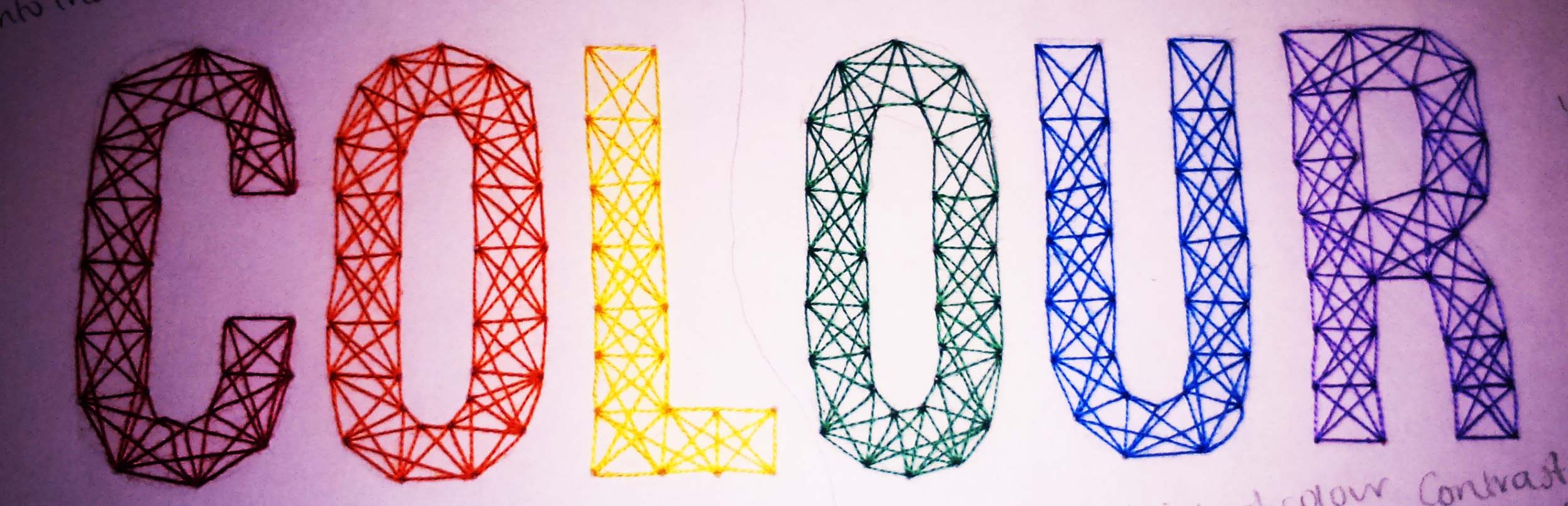
Looking at past Lovecraft Illustrations
Posted: July 31, 2015 Filed under: Subject, Third Year | Tags: animation, colour, film, h.p.lovecraft, horror, illustration, lovecraft, poster Leave a comment
Barret Chapman

Nathan Rosario

Bryan Baugh
What I really like about these illustrations is the way they create atmosphere and make you think about things larger than yourself and the unknown. Overall, mystery is what I really want to encapsulate in my narrative. I also want to think about colour schemes, as I want the whole short to feel whole rather than separate. I think I;m going to borrow the colours from the first illustration by Barret Chapman, as I like the idea of red and turquoise. I’ve talked before about the orange/ teal phenomenon in cinema. I want to steer clear of this in mine, but also think about why they use these contrasting colours. I want to change it up a little.
Back in the day film posters were much more diverse than they are now. I’ve found some red and green old ones, and some new ones that just happen to be teal and orange…


Understanding Colour- How Colours Interact
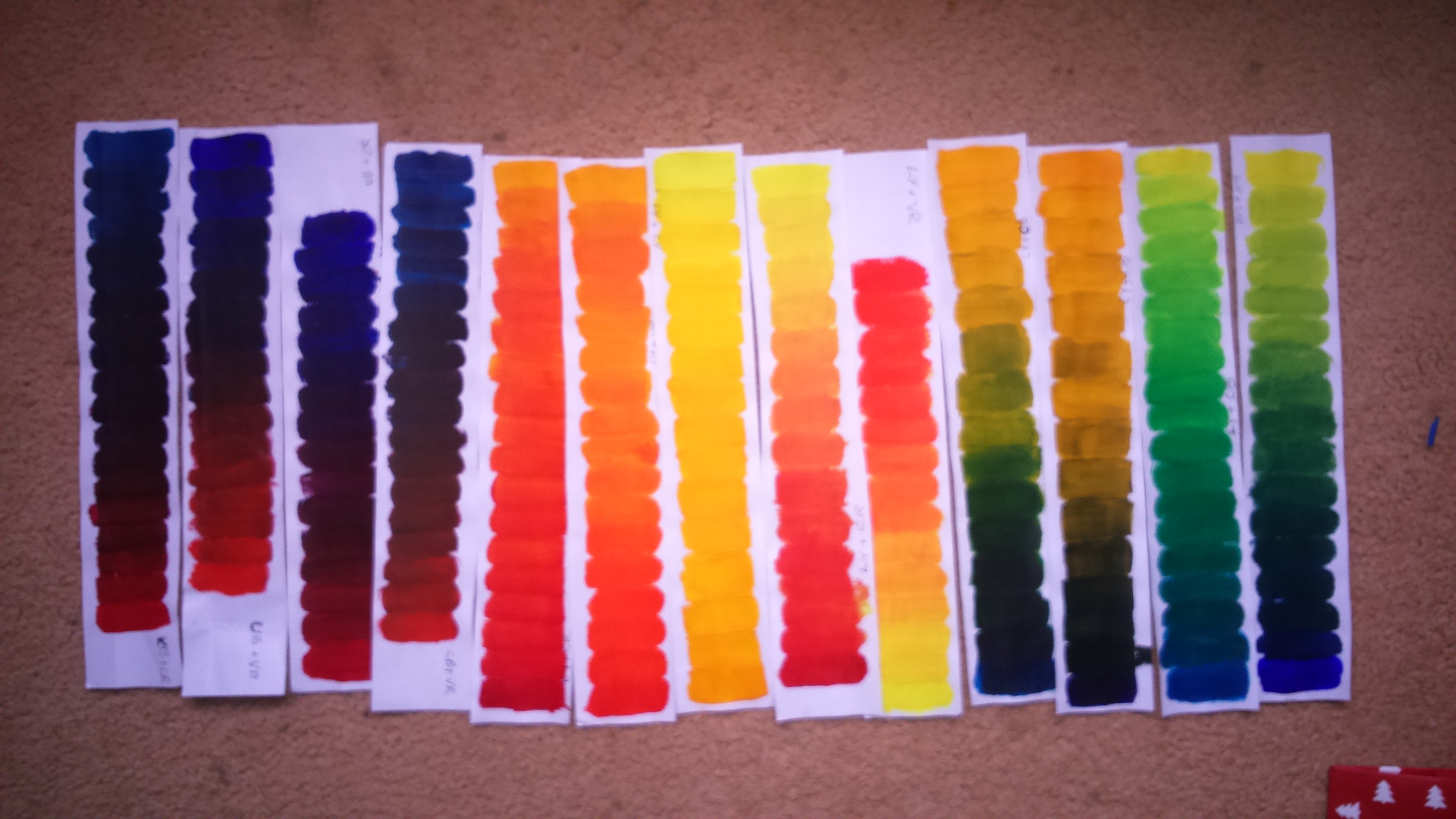
Posted: January 8, 2015 Filed under: Field | Tags: art, colour, illustration, theory Leave a commentWe were told today to create sheets of paper painted with the colours we’d made in the previous sessions, along with a few black, and mid-greys. We didn’t know what these were for until we started talking about the books “Interaction of Colour” by Josef Albers and “The Elements of Colour” by Johannes Itten. They’re about how colour is perceived differently when it is placed next to different colours.
So we went back and made out own colour combinations. I don’t think mine worked quite as well, but in photos I think they work a lot better for some reason?
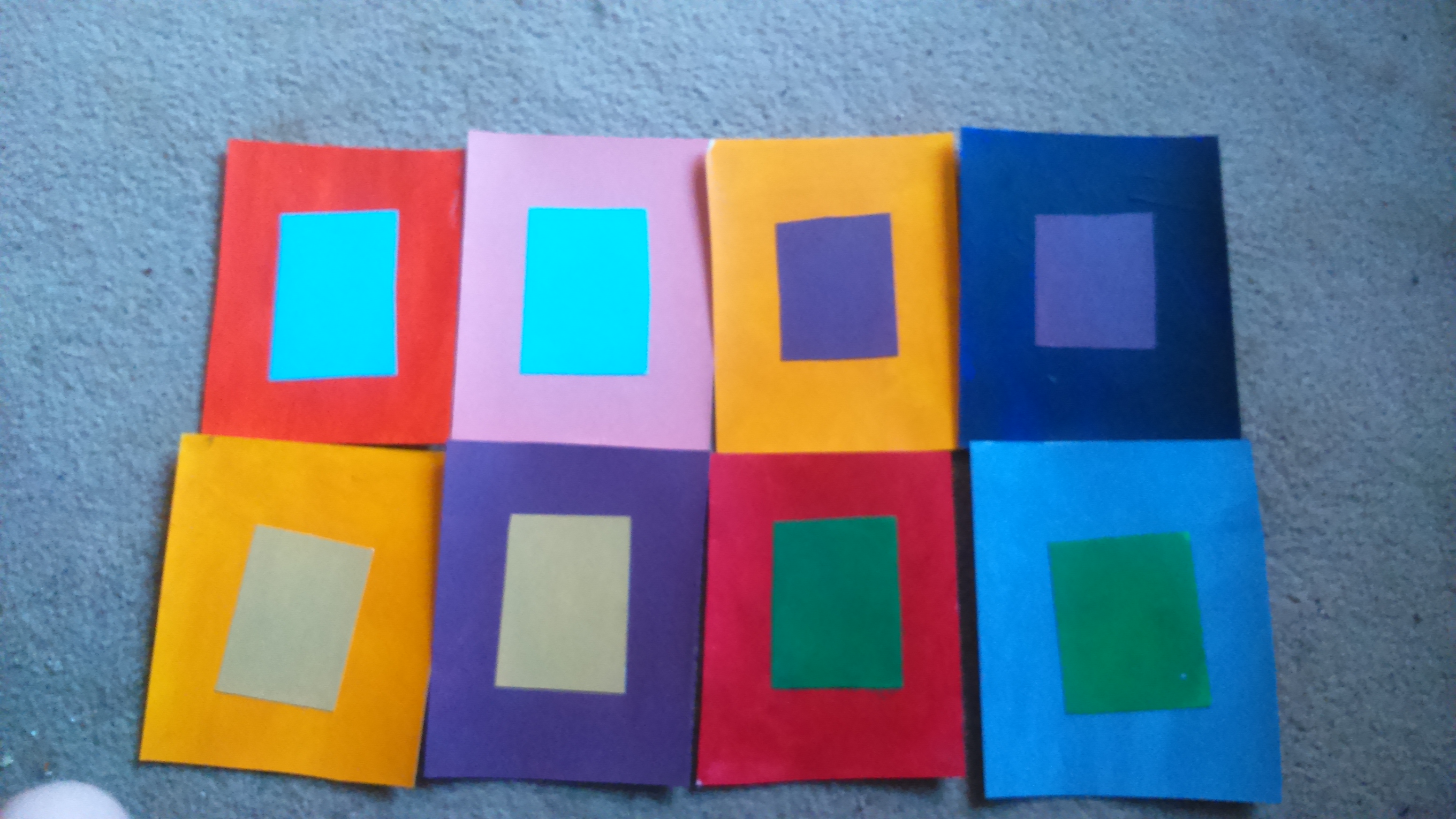
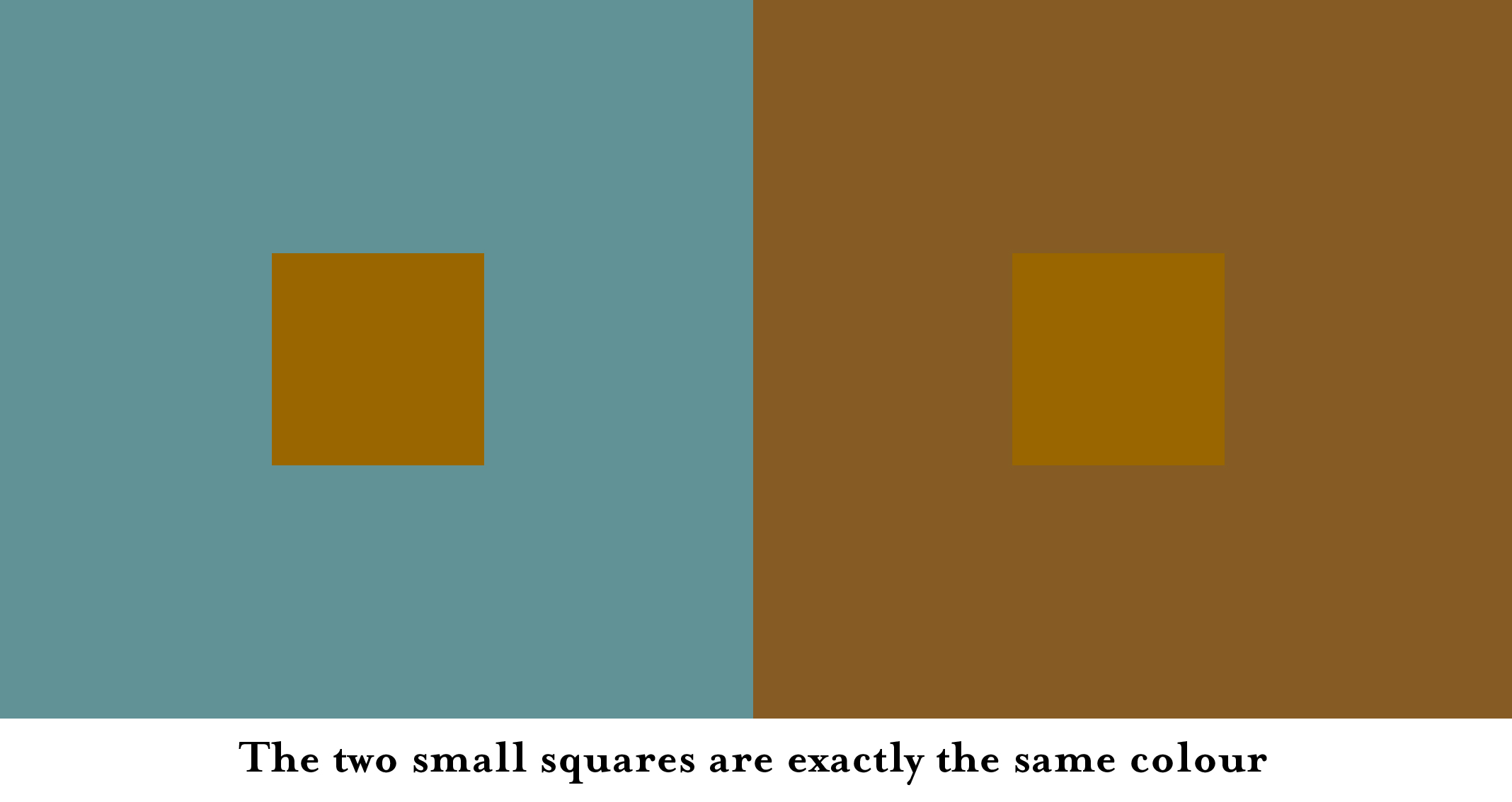
We also looked at how when you place a colour in front of grey, you can see a kind of halo of the complimentary around it. I had serious trouble seeing it! But everyone else seemed to be able to see it so.
As interesting as this session was, I’m not sure how I’d apply it to my subject work.
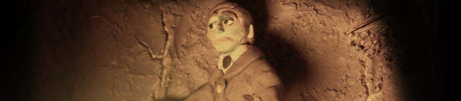
Field 1 In Relation to Subject 1
Posted: January 6, 2015 Filed under: Field, Subject | Tags: art, book illustration, colour, ghosts, horror, illustration Leave a commentI’ve been trying to think about colour in my Subject work, and looking through my sketch book, I’ve noticed that I’ve been subconsciously assigning colours to my ghost stories. The Treasure of Abbot Thomas is Yellow.

I think this is because I associate it with doing things at sunset, and greed, and candle light. It’s essentially a treasure hunt, and so I’ve done all of my illustrations gold.
I’ve made all of my Upper Berth illustrations blue. I feel like this is a bit obvious. Because it’s at sea. Maybe I should think more about the colours that I use, to make my illustrations more interesting in future.

During one of our lectures we were told about an artist who makes colour wheels of other artists paintings. This was one that I particularly liked.

It’s all the colours used in a JMW painting. And I think the colours in it are really beautiful.

So I thought maybe I could do the same thing and use the colours from a painting I like, to create my own work. I thought the best way to separate the colours of a painting was to crystallise it on photoshop, and then recreate the colours I found, using the techniques we were shown during “Understanding Colour”.

I then used the colours I’d made to paint a 3D relief I’d already done.

Although I’m not completely happy with it, I think it’s a lot more interesting and intriguing than a lot of my other work. The blue adds a bit of depth, and I liked doing the background wall black instead of brown, like I would usually have done. I also like working in 3D I have discovered.
NOTE TO SELF: always fire clay models, because this one is broken now.
Understanding Colour- Mixing Black
Posted: January 5, 2015 Filed under: Field | Tags: art, colour, paint Leave a commentWhen David said we were going to be making black using the three primary colours I got a little angry. Because I was so certain that mixing all the primaries made brown. But when we started it seemed to work a lot better than I had expected. It especially showed how good it had worked when we made gradients of the two blacks.

The top one is the black that I made, and the bottom is the black from the tube. I think the manufactured black looks really blue next to mine. I’ve had comments before that I use too much black in my work. I think this will be useful because I’ll think more about the type of black I mix rather than just using ready mixed black.
Understanding Colour – Matching Colours
Posted: January 5, 2015 Filed under: Field | Tags: art, colour, field, illustration, paint Leave a commentWe were told to bring in some magazines to this session. We then found colours that we liked in the magazine and had to match them using just the 6 shades of primary we were given and white. I thought this was going to be really hard without black (I tend to use a lot of black when mixing colours) but it actually worked out pretty well.
What I found hard was recording what colour I was adding, because I was adding tiny bits of loads of colour. If I were to do it again, I would try and be more precise with what colours I was adding. But over all it was pretty useful because it made me think about what colours are made up of. I would never have thought to add a red to a bright turquoise before. And adding the complementary colour really does make it duller, when before I would have just added black. This actually works a lot better.

Next we looked at how to mix more organic colours. We were given fruits and vegetables to match. I found this a lot harder because the food had a lot of texture and patterns so it was hard to focus on one colour. To make it easier we were given three new colours. We had three different browns, each one was predominantly one primary. They were called Burnt Sienna, Raw Umber and Yellow Ochre.

Yellow Ochre (Yellow Tertiary)

Raw Umber (Blue Tertiary)

Burnt Sienna (Red Tertiary)
The one I found the most difficult was definitely the banana. I don’t know why is was so difficult! But David said a lot of people were having trouble with it. I think I got pretty close so over all I’m happy.

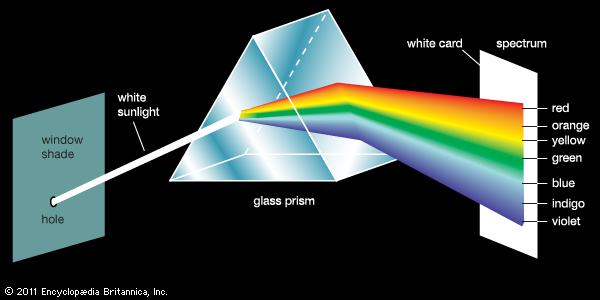
Understanding Colour 1
Posted: December 24, 2014 Filed under: Field | Tags: art, colour, illustration, theory Leave a commentI chose to do Understanding Colour for my field option because I’ve noticed that my work is very brown and grey. I do sometimes add colour to my work but I’m not sure it’s always successful. I also enjoyed Tom’s workshop at the beginning of the year about form and colour and wanted to look more into it. Our first lecture was fairly interesting, but I had already looked at a lot we had talked about while in my Foundation course.
”In 1676 Sire Isaac Newton, using a triangular prism, analysed white sunlight into a spectrum of colours”- The Elements of Colour by Johannes Itten,
According to him there were 7 types of colour contrast;
- Contrast of hue (black/white, red/yellow/blue)
- Light/ Dark contrast
- Cold/ Warm contrast (More distant objects appear colder in colour)
- Complimentary contrast
- Simultaneous contrast
- Contrast of saturation
- Contrast of extension (Proportions of complimentary pairs are
Yellow : Violet = 3 : 1
Orange : Blue = 2 : 1
Red : Green = 1 : 1
There is also a chapter on what I find most interesting; the relation of colour to form. We all related colours to shapes. Is this because of outward stimuli (e.g. seeing road sings) or because we there is something inherent about the shapes.
Red – Square…. Weight and opacity of red agree with the static, aggressive shape of the square
Yellow – Triangle …. Symbol of thought matched with lucid yellow
Blue – Circle…. Relaxation and smooth motion. Symbol of spirit.
+ + +
In the afternoon we looked at how there are three primary colours; red, yellow and blue. And three secondary colours; green, purple and orange. But then there are several different types of the primaries, especially when you’re painting. These paints are not “pure” primaries, but rather slightly mixed with other secondaries.

This means you have to think about which paints you use when you want to mix them. If you were to use a purpley blue with a orangey yellow you would end up with a muddy green because there would be too much red in the paints. Because red is the opposite to green it would make the green turn brown.
To illustrate this we mixed all the coloured paints together, both shades of each primary with each other. So in total there were 15 combinations. The gradients would help us later with matching colours.